There are 6 different properties the flex container can take on.
flex-direction
flex-direction (FlexBox Property)
graph LR FD[flex-direction, Controls:] --> Order[Which order] FD --> Direction[Which direction] FD --> Side[From which side of the box] Order --> Placement[the elements are placed] Direction --> Placement Side --> PlacementFlex Direction Controls:
- which order
- which direction
- from which side of the box
the elements are placed.
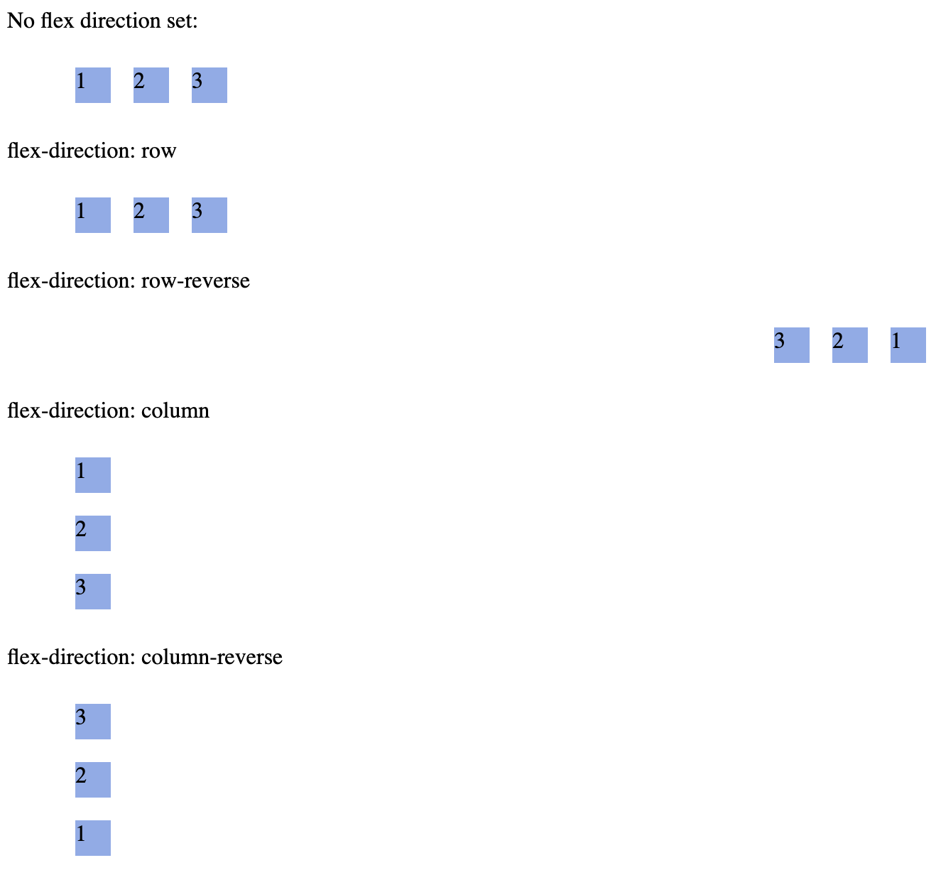
/* There are 4 values for the property, example setting this property where ul represents a flex container, */ ul { flex-direction: row || column || row-reverse || column-reverse; }
{max-width: 500px, display: block, margin: 0 auto, border: 5px solid black}
GT-Sandbox-Snapshot
Command to reproduce:
gt.sandbox.checkout.commit 870edcc21fa6ffb73d26 \ && cd "${GT_SANDBOX_REPO}" \ && cmd.run.announce "chrome ./main/index.html"Recorded output of command:
_chrome ./main/index.html Opening in chrome: ./main/index.html
Controls main axis direction (vertical/horizontal)
The
flex-directioncontrols whether main-axis is vertical or horizontal.Below is example of axis when
Link to originalflex-directionis set torow{max-width: 500px, display: block, margin: 0 auto, border: 5px solid black}
flex-wrap
Flex Wrap
The
flex-wrapproperty determines whether flex items are forced onto a single line or can wrap onto multiple lines when they overflow the container.Values & Behavior
Value Description nowrapAll items stay on one line. Items will shrink (if allowed) rather than wrap. wrapItems wrap onto multiple lines from top to bottom (for flex-direction: row).wrap-reverseItems wrap onto multiple lines but in reverse order (bottom to top for rows). .container { display: flex; flex-wrap: wrap; /* allow wrapping */ }
Code Example
<div class="container"> <div class="item">1</div> <div class="item">2</div> <div class="item">3</div> <div class="item">4</div> </div>.container { display: flex; flex-wrap: wrap; gap: 1rem; width: 300px; /* container narrower than 4 items */ } .item { flex: 1 1 100px; /* grow, shrink, base width */ }Result: Items 1–3 fit on the first row; item 4 wraps onto the second row.*
Use Cases
- Responsive Galleries: Automatically move thumbnails to new rows when the viewport narrows.
- Navigation Menus: Wrap menu items to a second line on smaller screens instead of shrinking text.
- Tag Clouds & Chips: Let labels flow onto multiple lines gracefully.
Tip: Combine with
Link to originaljustify-contentandalign-contentto control spacing of wrapped lines.
flex-flow (shorthand for flex-direction & flex-wrap)
Flex Flow
Shorthand for:
flex-direction
flex-direction (FlexBox Property)
graph LR FD[flex-direction, Controls:] --> Order[Which order] FD --> Direction[Which direction] FD --> Side[From which side of the box] Order --> Placement[the elements are placed] Direction --> Placement Side --> PlacementFlex Direction Controls:
- which order
- which direction
- from which side of the box
the elements are placed.
/* There are 4 values for the property, example setting this property where ul represents a flex container, */ ul { flex-direction: row || column || row-reverse || column-reverse; }
{max-width: 500px, display: block, margin: 0 auto, border: 5px solid black}
GT-Sandbox-Snapshot
Command to reproduce:
gt.sandbox.checkout.commit 870edcc21fa6ffb73d26 \ && cd "${GT_SANDBOX_REPO}" \ && cmd.run.announce "chrome ./main/index.html"Recorded output of command:
_chrome ./main/index.html Opening in chrome: ./main/index.html
Controls main axis direction (vertical/horizontal)
The
flex-directioncontrols whether main-axis is vertical or horizontal.Below is example of axis when
Link to originalflex-directionis set torow{max-width: 500px, display: block, margin: 0 auto, border: 5px solid black}
flex-wrap
Flex Wrap
The
flex-wrapproperty determines whether flex items are forced onto a single line or can wrap onto multiple lines when they overflow the container.Values & Behavior
Value Description nowrapAll items stay on one line. Items will shrink (if allowed) rather than wrap. wrapItems wrap onto multiple lines from top to bottom (for flex-direction: row).wrap-reverseItems wrap onto multiple lines but in reverse order (bottom to top for rows). .container { display: flex; flex-wrap: wrap; /* allow wrapping */ }
Code Example
<div class="container"> <div class="item">1</div> <div class="item">2</div> <div class="item">3</div> <div class="item">4</div> </div>.container { display: flex; flex-wrap: wrap; gap: 1rem; width: 300px; /* container narrower than 4 items */ } .item { flex: 1 1 100px; /* grow, shrink, base width */ }Result: Items 1–3 fit on the first row; item 4 wraps onto the second row.*
Use Cases
- Responsive Galleries: Automatically move thumbnails to new rows when the viewport narrows.
- Navigation Menus: Wrap menu items to a second line on smaller screens instead of shrinking text.
- Tag Clouds & Chips: Let labels flow onto multiple lines gracefully.
Tip: Combine with
Link to originaljustify-contentandalign-contentto control spacing of wrapped lines.Example
Link to original ul { flex-flow: row wrap; /*direction [row] and [wrap] items */ }
justify-content
justify-content (FlexBox property)
The
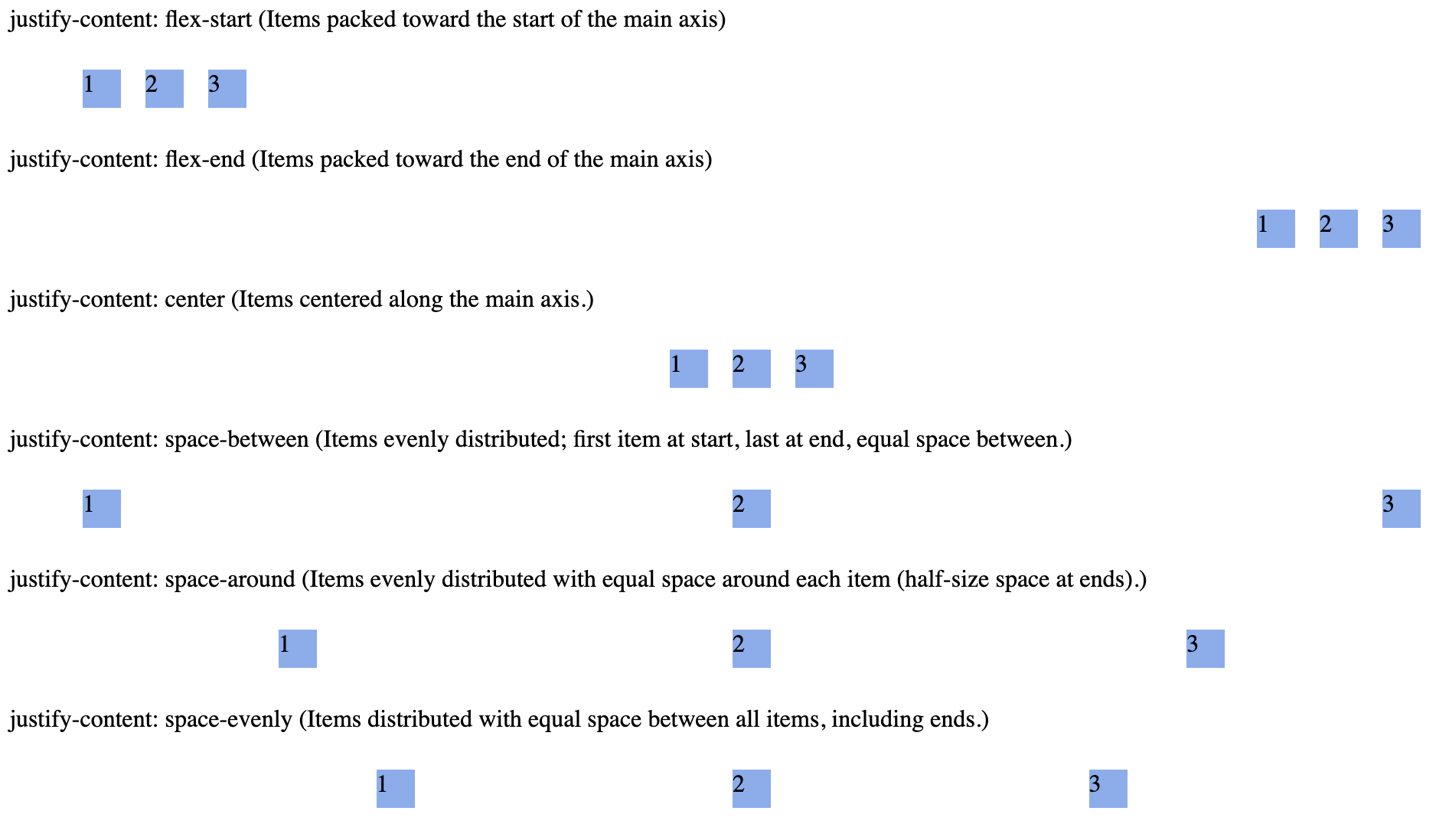
justify-contentproperty aligns flex items along the main axis (horizontal in defaultflex-direction: row). It distributes extra space when items do not fully occupy the container.Image: Flex box Main Axis Horizontal (flex-direction: row)
Link to original
{max-width: 500px, display: block, margin: 0 auto, border: 5px solid black}
Available Values
Value Description flex-startItems packed toward the start of the main axis (left in LTR). flex-endItems packed toward the end of the main axis (right in LTR). centerItems centered along the main axis. space-betweenItems evenly distributed; first item at start, last at end, equal space between. space-aroundItems evenly distributed with equal space around each item (half-size space at ends). space-evenlyItems distributed with equal space between all items, including ends.
Code Example
{max-width: 500px, display: block, margin: 0 auto, border: 5px solid black}
GT-Sandbox-Snapshot
Command to reproduce:
gt.sandbox.checkout.commit a57600e8b590e7527511 \ && cd "${GT_SANDBOX_REPO}" \ && cmd.run.announce "chrome ./main/index.html"Recorded output of command:
_chrome ./main/index.html Opening in chrome: ./main/index.htmlUse Cases
- Navigation Bars: Align links to the left, center, or right.
- Toolbars: Distribute buttons evenly or group them at edges.
- Card Layouts: Control spacing between cards in a row.
Tip: For vertical alignment (cross-axis), use
Link to originalalign-itemsoralign-contentinstead.
align-items
Align Items
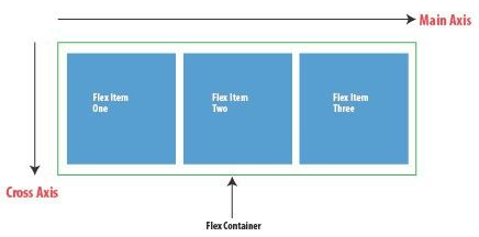
align-itemslike justify-content but for cross-axis.Link to originalImage: Flex box Main Axis Horizontal (flex-direction: row)
Link to original
{max-width: 500px, display: block, margin: 0 auto, border: 5px solid black}
align-content
align-content
The align-content property is used on multi-line flex-containers.
Controls how the flex-items are aligned in a multi-line flex container.
Link to original
{max-width: 500px, display: block, margin: 0 auto, border: 5px solid black}