Per Specification: the flexbox model provides for an efficient way to layout, align, and distribute space among elements within your document, even when the viewport and the size of your elements is dynamic or unknown.
To use the flexbox model, you must make a parent element a flex container (aka flexible container).
You do this by setting display: flex or display: inline-flex for the inline variation. It’s that simple, and from there you’re all set to use the Flexbox model.
/*Make parent element a flex container*/ul { display: flex; /*or inline-flex*/}
Basic Flexbox GT-Sandbox-Snapshot
Command to reproduce:
gt.sandbox.checkout.commit 68cf8efc8214fbb76aed \&& cd "${GT_SANDBOX_REPO}" \&& cmd.run.announce "chrome ./main/index.html"
Recorded output of command:
_chrome ./main/index.htmlOpening in chrome: ./main/index.html
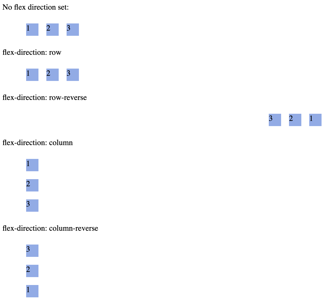
There are 6 different properties the flex container can take on.
flex-direction
flex-direction (FlexBox Property)
graph LR

FD[flex-direction, Controls:] --> Order[Which order]
FD --> Direction[Which direction]
FD --> Side[From which side of the box]
Order --> Placement[the elements are placed]
Direction --> Placement
Side --> Placement
Flex Direction Controls:
which order
which direction
from which side of the box
the elements are placed.
/* There are 4 values for the property, example setting this propertywhere ul represents a flex container, */ul { flex-direction: row || column || row-reverse || column-reverse;}
GT-Sandbox-Snapshot
Command to reproduce:
gt.sandbox.checkout.commit 870edcc21fa6ffb73d26 \&& cd "${GT_SANDBOX_REPO}" \&& cmd.run.announce "chrome ./main/index.html"
Recorded output of command:
_chrome ./main/index.htmlOpening in chrome: ./main/index.html
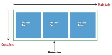
Controls main axis direction (vertical/horizontal)
The flex-direction controls whether main-axis is vertical or horizontal.
Below is example of axis when flex-direction is set to row
flex-flow (shorthand for flex-direction & flex-wrap)
Flex Flow
Shorthand for:
flex-direction
flex-direction (FlexBox Property)
graph LR

FD[flex-direction, Controls:] --> Order[Which order]
FD --> Direction[Which direction]
FD --> Side[From which side of the box]
Order --> Placement[the elements are placed]
Direction --> Placement
Side --> Placement
Flex Direction Controls:
which order
which direction
from which side of the box
the elements are placed.
/* There are 4 values for the property, example setting this propertywhere ul represents a flex container, */ul { flex-direction: row || column || row-reverse || column-reverse;}
GT-Sandbox-Snapshot
Command to reproduce:
gt.sandbox.checkout.commit 870edcc21fa6ffb73d26 \&& cd "${GT_SANDBOX_REPO}" \&& cmd.run.announce "chrome ./main/index.html"
Recorded output of command:
_chrome ./main/index.htmlOpening in chrome: ./main/index.html
Controls main axis direction (vertical/horizontal)
The flex-direction controls whether main-axis is vertical or horizontal.
Below is example of axis when flex-direction is set to row
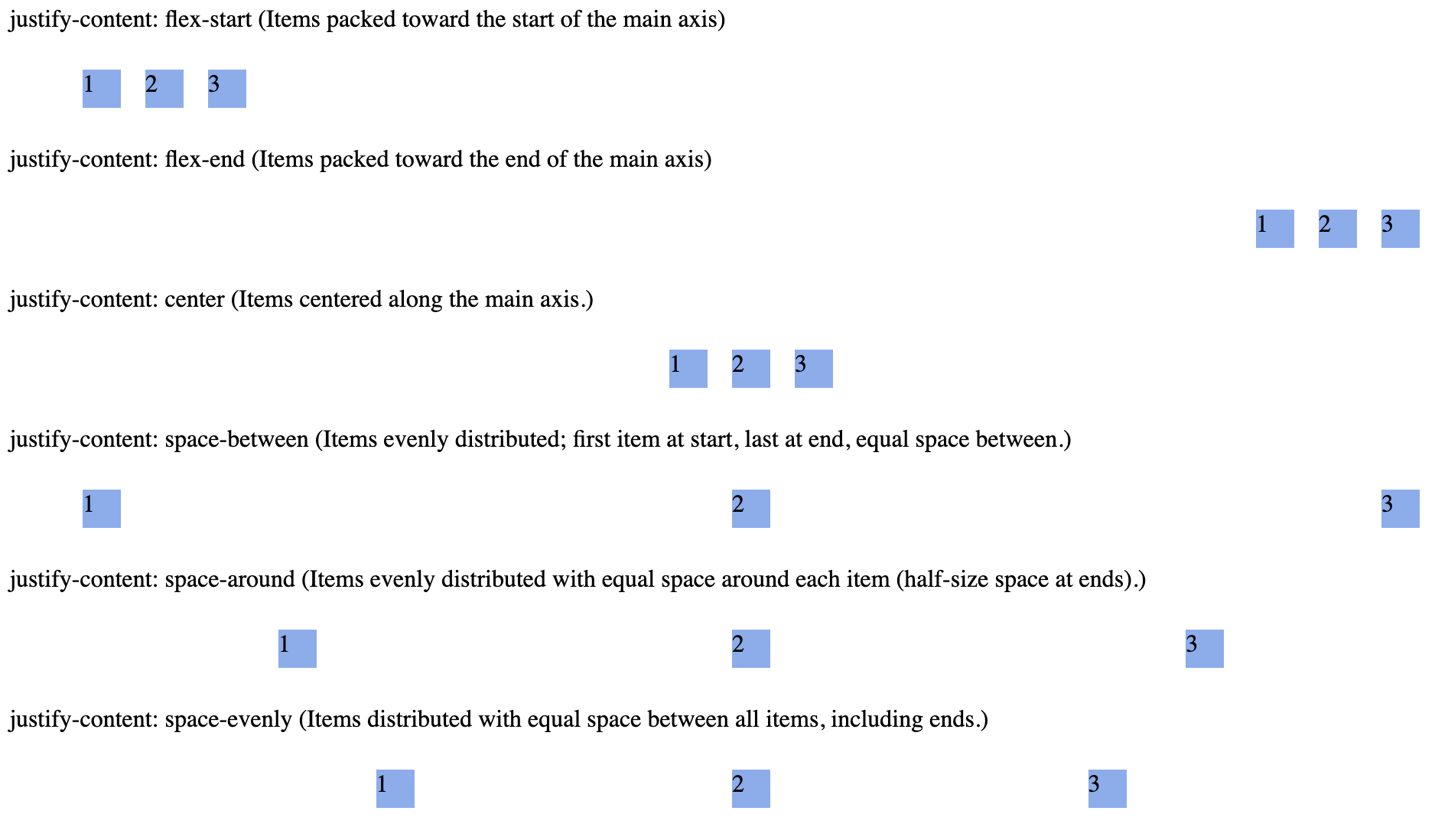
The justify-content property aligns flex items along the main axis (horizontal in default flex-direction: row). It distributes extra space when items do not fully occupy the container.
Image: Flex box Main Axis Horizontal (flex-direction: row)
Flex items: The children elements within a flex-container.
As soon as you set the display property to flex of ul (unordered list), the unordered list automatically becomes the flex container and the child elements (in this case, the list elements li) become flex items.
Properties
Flex Item Properties
Some references for flex item properties: www.educative.io course (ok but he confuses some terminoly around main axis).
Example Usage:
Flex Items to Take up Available Space on Main Axis (flex: 1)
Shorthanded as flex: 1;
or flex: 1 1 0;
.child { /* Allows the child to grow and fill remaining space */ flex-grow: 1; /* Allows the child to shrink if there's not enough space */ flex-shrink: 1; /* Starts with no base size; enables flexible resizing */ flex-basis: 0;}
Image: Flex box Main Axis Horizontal (flex-direction: row)
gt.sandbox.checkout.commit 1d051ecce7083ca9b340 \&& cd "${GT_SANDBOX_REPO}" \&& cmd.run.announce "chrome ./main/index.html"
Recorded output of command:
_chrome ./main/index.htmlOpening in chrome: ./main/index.html
Purpose
flex-grow: 1
Instructs this item to expand and occupy any remaining space in the container.
flex-shrink: 1
Allows it to contract proportionally if there’s less space than its content needs.
flex-basis: 0%
Sets its starting size to zero, so growth/shrink behavior is driven purely by available space.
When to Use
You want one or more flex items to share leftover space evenly.
You have a mix of fixed-size and flexible elements (e.g. a fixed sidebar next to a content panel that fills the rest).
You need a fluid, responsive layout where children naturally stretch or shrink.
Main-Axis Impact
These properties control sizing along the main axis defined by the parent’s flex-direction:
If flex-direction: row, they adjust width.
If flex-direction: column, they adjust height.
Using this pattern ensures your flex children flexibly fill whatever space is available along the main axis, while still respecting margins, padding, borders, and any max-/min-size limits.