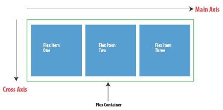
Some references for flex item properties: www.educative.io course (ok but he confuses some terminoly around main axis).
Example Usage:
Flex Items to Take up Available Space on Main Axis (flex: 1)
Shorthanded as flex: 1;
or flex: 1 1 0;
.child { /* Allows the child to grow and fill remaining space */ flex-grow: 1; /* Allows the child to shrink if there's not enough space */ flex-shrink: 1; /* Starts with no base size; enables flexible resizing */ flex-basis: 0;}
Image: Flex box Main Axis Horizontal (flex-direction: row)
gt.sandbox.checkout.commit 1d051ecce7083ca9b340 \&& cd "${GT_SANDBOX_REPO}" \&& cmd.run.announce "chrome ./main/index.html"
Recorded output of command:
_chrome ./main/index.htmlOpening in chrome: ./main/index.html
Purpose
flex-grow: 1
Instructs this item to expand and occupy any remaining space in the container.
flex-shrink: 1
Allows it to contract proportionally if there’s less space than its content needs.
flex-basis: 0%
Sets its starting size to zero, so growth/shrink behavior is driven purely by available space.
When to Use
You want one or more flex items to share leftover space evenly.
You have a mix of fixed-size and flexible elements (e.g. a fixed sidebar next to a content panel that fills the rest).
You need a fluid, responsive layout where children naturally stretch or shrink.
Main-Axis Impact
These properties control sizing along the main axis defined by the parent’s flex-direction:
If flex-direction: row, they adjust width.
If flex-direction: column, they adjust height.
Using this pattern ensures your flex children flexibly fill whatever space is available along the main axis, while still respecting margins, padding, borders, and any max-/min-size limits.